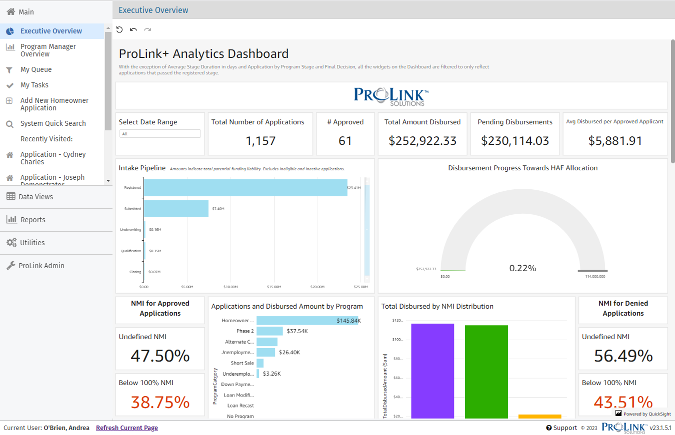
Executive Overview
The Executive Overview displays high-level information about the agency's programs. This screen provides the Executive Director and Program Manager with summary financial information at both the fund and program levels and graphically depicts various performance metrics.
When you click a graph or chart, a set of controls becomes available on the right side. You can use these to maximize/minimize the graph/chart on the screen, view summary information, and export the graph/chart to a CSV file.

To undo, redo, or reset the changes you make, use the controls at the top of the screen, below the header.

Name | Description | Example |
|---|---|---|
Select Date Range | Allows you to filter the dashboard for data based on a date range. Default selection is all, meaning no filter. |  |
Total Number of Applications | Displays a count of all applications that have made it to Stage 2 (submitted) and beyond. | 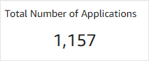 |
# Approved | Displays a count of all applications where Approved for Benefits has been set to "Yes." | 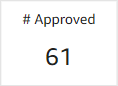 |
Total Amount Disbursed | Displays the total of paid disbursements across all applications. |  |
Pending Disbursements | Displays a sum of all disbursements that are currently in Pending status. | 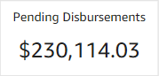 |
Avg Disbursed per Approved Applicant | Average amount disbursed for applicants who were approved. Does not include those who were denied or withdrawn. | 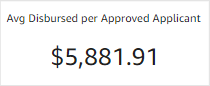 |
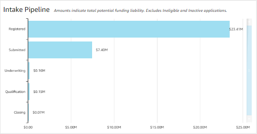
Intake Pipeline | Displays detail by stage of:
|  |
Disbursement Progress Towards HAF Allocation | Displays disbursement progress towards the HAF allocation Amount. The HAF Allocation Amount can be found on the Fund option in the Admin panel. | 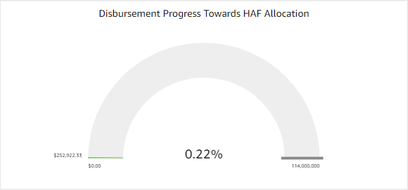 |
NMI for Approved Applications | Displays the NMI breakdown for all applications where Approved for Benefits = "Yes." |  |
Applications and Disbursed Amount by Program | Displays a count of applications and sum of disbursements by Program, and Program Category, if available. Only includes applications that have made it to Stage 2 (submitted) and beyond. | 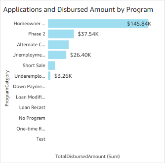 |
Total Disbursed by NMI Distribution | Displays a breakdown of all disbursed funding by applicant NMI classification. | 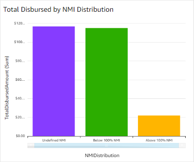 |
NMI for Denied Applications | Displays the NMI breakdown for all applications where Approved for Benefits = "No." | 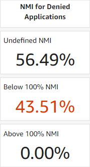 |
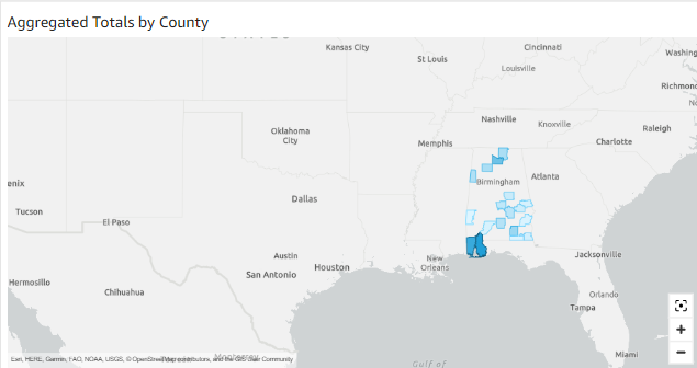
Aggregated Totals by County | Heatmap depicting total disbursed amount by county. Darker shades of blue indicate more money. Point to a county for a tooltip that shows a breakdown of the following:
|  |
Amount disbursed by Program Category | Shows total disbursed amount broken down by Program and Program Category. | 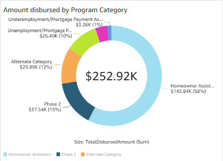 |
All Applications by Stage and Status | Shows a breakdown of all applications with detail on status by stage. | 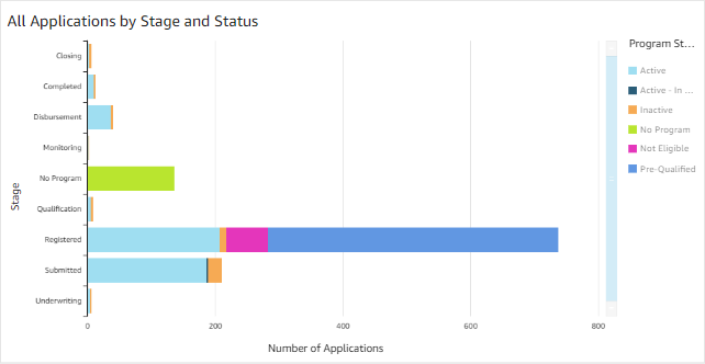 |
Outcome Breakdown | Depicts a breakdown of final outcome. Withdrawn sections are derived from Inactive reason selection, and may not be consistent across client environments. | 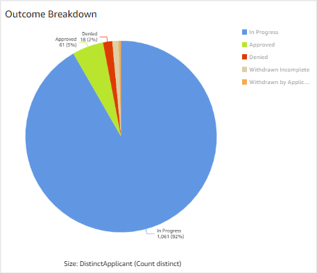 |
Registered Applications by Month | Displays a count of applications that registered, broken down by month. | 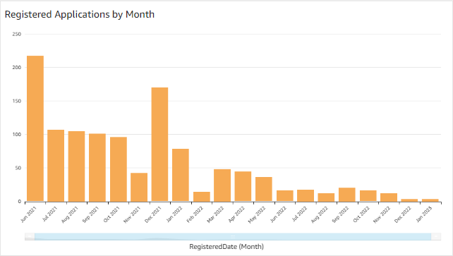 |
Average Stage Duration in Days | Displays the average time active applications have spent in each stage. | 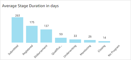 |
Inactive Applications by Reason | Displays a breakdown of all inactive applications, grouped by Inactive Reason. | 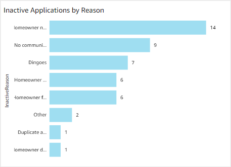 |
Submitted Applications by Month | Displays a count of applications that were submitted, broken down by month. | 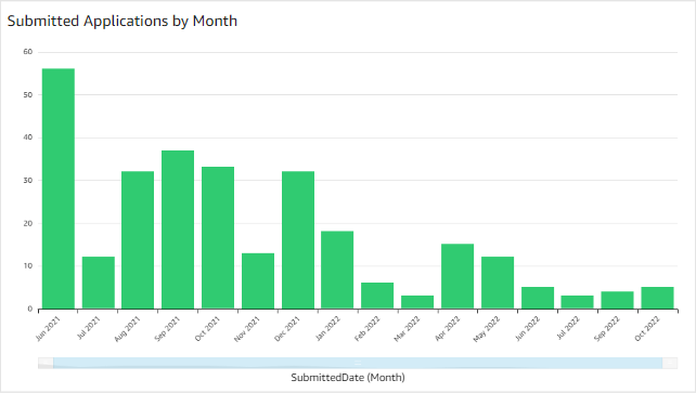 |